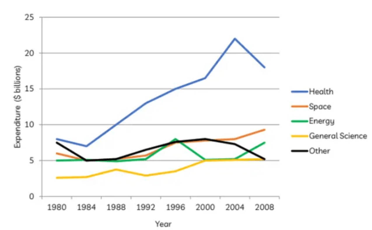
The graph below gives information about U.S government spending on research between 1980 and 2008
Practice this IELTS Writing Task 1 question on IELTSX. The graph below gives information about U.S government spending on research between 1980 and 2008
US Government Research Spending 1980-2008 Line Graph - IELTS Writing Task 1
You should spend about 20 minutes on this task.
Summarise the information by selecting and reporting the main features, and make comparisons where relevant.
Write at least 150 words.
A student's answer to this task, and the feedback on it
Written by an IELTSX user under exam conditions and published unedited and anonymously. Band 6.5 · 220 words.
The line grahp provides information about the U.S goverment's expenditure on research in five fields ( Health , Space , Energy , General Science on Others ) over the period from 1980 to 2008.
Overall, it can be clearly seen that the US goverment spent the largest amout of money on research into Health while the largest amout of money was spent of resarching General Science.
Starting at $10 billion in 1980, the goverment expenditure on resarching into Health slightly dropped over the next four years before continually rising again to peak of nearly $25 billion in 2004. Despite declining back to approximately $18 billion in 2008 , expenditure on Health resarch was by far the highest. The amout of money spent on researching General Science however was the lowest of all research categories , beginning at $2.5 billion in 1980 and rising to just over $5 billion by 2008.
Meanwhile, there was also an increase in the money that was spent on research into Energy and Space from approximately $5 billion and $6 billion in 1980 to around $7.5 billion and $9 billion in 2008, respectly. In contrast, the only field that experienced an overall, decrease in expenditure was that of resarch into other areas, which fell from approximetely $7.5 billion in 1980 to about $5 billion by 2008.
Examiner feedback
The response is well-structured and accurately describes the main trends of the graph. The use of a clear overview and logical paragraphing allows the reader to follow the information easily. To improve the score, the writer must focus on spelling accuracy and broadening the variety of lexical items used for comparison.
Task Achievement - 7
- The response covers all requirements of the task by identifying the highest and lowest spending areas. - A clear overview is provided in the second paragraph, highlighting the dominant field. - Main trends are supported with accurate data from the graph, though some comparisons could be more detailed.
Coherence & Cohesion - 7
- Information is organized logically with clear paragraphing for different categories. - Cohesive devices like "Meanwhile" and "In contrast" are used effectively to show transitions. - There is a clear overall progression throughout the report from the introduction to the conclusion of the data sets.
Lexical Resource - 6
- The range of vocabulary is sufficient to describe trends and figures accurately (e.g., "expenditure", "experienced", "peaked"). - There are frequent spelling errors such as "grahp", "goverment", "amout", "resarch", and "respectly". - While these errors do not impede communication, their frequency limits the score to a 6.0.
Grammatical Range & Accuracy - 7
- A variety of complex structures are used, such as starting sentences with present participle phrases ("Starting at..."). - Grammar is generally well-controlled, though minor errors like "spent of" instead of "spent on" occur. - Punctuation is used correctly to separate clauses and lists.
Related prompts
- Male Female Students Art Related Subjects UK University 2011
- Town Centre Changes 1990 and Today
- Male Female Students High Grades Five Subjects Parston School National Average
- Qualifications Staff Advertising Company 1990 and 2010
- Australian School Leavers Activity 1980 1990 2000
- Layout Town Shopping Centre Present and Future Redevelopment