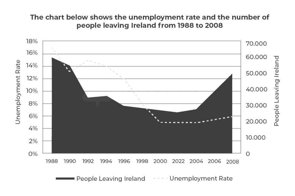
The chart below shows the unemployment rate and the number of people leaving Ireland from 1988 to 2008
Practice this IELTS Writing Task 1 question on IELTSX. The chart below shows the unemployment rate and the number of people leaving Ireland from 1988 to 2008
Unemployment Rate People Leaving Ireland 1988-2008 Chart - IELTS Writing Task 1
You should spend about 20 minutes on this task.
Summarise the information by selecting and reporting the main features, and make comparisons where relevant.
Write at least 150 words.
A student's answer to this task, and the feedback on it
Written by an IELTSX user under exam conditions and published unedited and anonymously. Band 7.5 · 165 words.
The line graph compares the number of people leaving Ireland and the unemployment rate from 1988 up until 2008. Units are measured in percentages and thousands. From an overall perspective, the graph depicts fluctuations in both figures. Despite some minor variations, an overall upward trend can be observed towards the end of the period.
Regarding the number of people leaving Ireland, the figure started at nearly 60,000 in 1988 before dropping dramatically to about 35,000 by 1992. Thereafter, there was a minimal growth to around 37,000 by 1994, but it declined markedly again to roughly 21,000 by 2002. Following this dip, it climbed drastically to approximately 55,000 by 2008.
When it comes to the unemployment rate, the figure decreased notably to 13% by 1990 after commencing at 17% in 1988. After that, there was a marginal rise to 15% by 1992; however, it plummeted to about 5% by 2000. Then, the figure plateaued by 2004, and there was a slight increase to 6% by 2008.
Examiner feedback
This is a strong response that accurately describes the trends with high grammatical precision and sophisticated vocabulary. To improve further, the candidate could focus on integrating the data more effectively to highlight the lack of direct correlation between the two variables in the latter half of the period.
Task Achievement - 7
- The response covers all requirements of the task, providing a clear description of both variables over the full period. - A clear overview is presented, identifying the fluctuating nature of the data and the final upward movement. - Key features are highlighted and supported with data, though the relationship or lack thereof between the two lines could have been more explicitly contrasted to reach a higher band.
Coherence & Cohesion - 8
- Paragraphing is used appropriately and sufficiently, with clear logical transitions between the two data sets. - Cohesion is well managed through effective use of sequencers like 'thereafter', 'following this dip', and 'after that'. - Information is logically sequenced, following a chronological approach for each data series.
Lexical Resource - 8
- Vocabulary is used fluently and flexibly to convey precise meanings (e.g., 'plummeted', 'plateaued', 'declined markedly'). - There is skillful use of varied reporting verbs and adverbs to describe data changes. - Word choice and collocation are natural and appropriate for an academic report.
Grammatical Range & Accuracy - 8
- A wide range of structures is used accurately, including complex participial phrases such as 'after commencing at'. - The majority of sentences are error-free with precise control of punctuation. - Tenses are used correctly to describe historical data trends.
Related prompts
- Male Female Students Art Related Subjects UK University 2011
- Town Centre Changes 1990 and Today
- Male Female Students High Grades Five Subjects Parston School National Average
- Qualifications Staff Advertising Company 1990 and 2010
- Australian School Leavers Activity 1980 1990 2000
- Layout Town Shopping Centre Present and Future Redevelopment