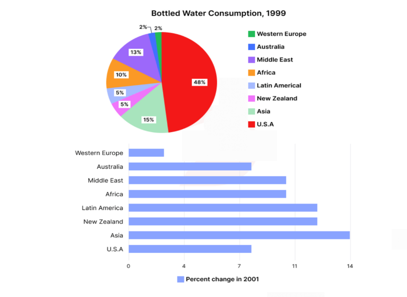
The pie graph below shows bottled water consumption in various regions as a percent of global consumption and the bar-chart shows the growth of bottled water consumption in 2001.
Practice this IELTS Writing Task 1 question on IELTSX. The pie graph below shows bottled water consumption in various regions as a percent of global consumption and the bar-chart shows the growth of bottled water consumption in 2001.
Bottled Water Consumption Global Regions Percentage Growth 2001 Chart - IELTS Writing Task 1
You should spend about 20 minutes on this task.
Summarise the information by selecting and reporting the main features, and make comparisons where relevant.
Write at least 150 words.
A student's answer to this task, and the feedback on it
Written by an IELTSX user under exam conditions and published unedited and anonymously. Band 8.5 · 169 words.
The charts illustrate the global distribution of bottled water consumption across various regions and the rate of growth in this consumption during the year 2001.
Overall, the USA was the dominant consumer of bottled water globally, while Western Europe and Australia recorded the smallest shares. In terms of growth, Asia [experienced the most rapid expansion], whereas Western Europe saw the most marginal increase.
Looking at the pie chart, the USA accounted for nearly half of the total global consumption at 48%. In contrast, Asia, Africa and Middle East, accounted for 15%, 10%, and 13%, respectively. Latin America and New Zealand recorded the same shares (5%), whereas the lowest consumption was in the Western Europe and Australia (both 2%).
Regarding the growth in 2001, Asia led the trend with a 14% increase. New Zealand and Latin America both saw a 12% rise, followed by the Middle East and Africa, where consumption grew by 10%. In stark contrast, Western Europe registered the slowest growth, with an increase of just under 5%.
Examiner feedback
This is a high-level response that demonstrates a clear understanding of the data and the ability to summarize it effectively. The overview is particularly strong, and the data selection is logical. To reach a Band 9, ensure that every single region mentioned in the first chart is accounted for in the growth description to avoid even minor omissions.
Task Achievement - 8
- The response covers all requirements of the task, including a clear overview that identifies the main trends from both charts. - Key features are skillfully selected; the writer correctly identifies the USA as the primary consumer and Asia as the fastest-growing market. - All data points are accurately reported, though Australia's growth rate was omitted in the second body paragraph, which is a minor omission.
Coherence & Cohesion - 9
- The organization is logical and follows a standard academic structure (Introduction, Overview, Details for Chart 1, Details for Chart 2). - Cohesive devices like 'In contrast,' 'respectively,' and 'Regarding' are used naturally and do not attract undue attention. - The progression of information is effortless to follow, with clear transitions between different data sets.
Lexical Resource - 8
- The vocabulary is sophisticated and appropriate for an academic report (e.g., 'dominant consumer,' 'marginal increase,' 'stark contrast'). - There is a good range of synonyms for 'show' and 'increase,' such as 'illustrate,' 'accounted for,' and 'expansion.' - Minor inaccuracies like 'the Western Europe' (superfluous article) are very rare and do not affect meaning.
Grammatical Range & Accuracy - 9
- A wide range of structures is used with full flexibility, including complex comparative sentences and participial phrases. - The majority of sentences are error-free. - Punctuation is used correctly to separate clauses and list items (e.g., the use of 'respectively').
Related prompts
- Male Female Students Art Related Subjects UK University 2011
- Town Centre Changes 1990 and Today
- Male Female Students High Grades Five Subjects Parston School National Average
- Qualifications Staff Advertising Company 1990 and 2010
- Australian School Leavers Activity 1980 1990 2000
- Layout Town Shopping Centre Present and Future Redevelopment